If you’ve ever wondered what goes into the illustration process of a picture book, this is the blog post for you. Illustrator Dub Leffler is a descendant of the Bigambul people of South West Queensland and one of Australia’s most sought-after children’s book illustrators. He has created 23 books and I’ve been fortunate enough to edit two of them—Sorry Day by Coral Vass (2018) and Strangers on Country by Kirsty Murray and Dave Hartley (2020)—which were both published by the National Library of Australia (NLA Publishing).
In this interview Dub takes us behind the scenes on his creative process for Sorry Day and Strangers on Country and gives us an insight into the publishing process, which is particularly invaluable for emerging picture book creators wanting to understand the nuts and bolts of it all.
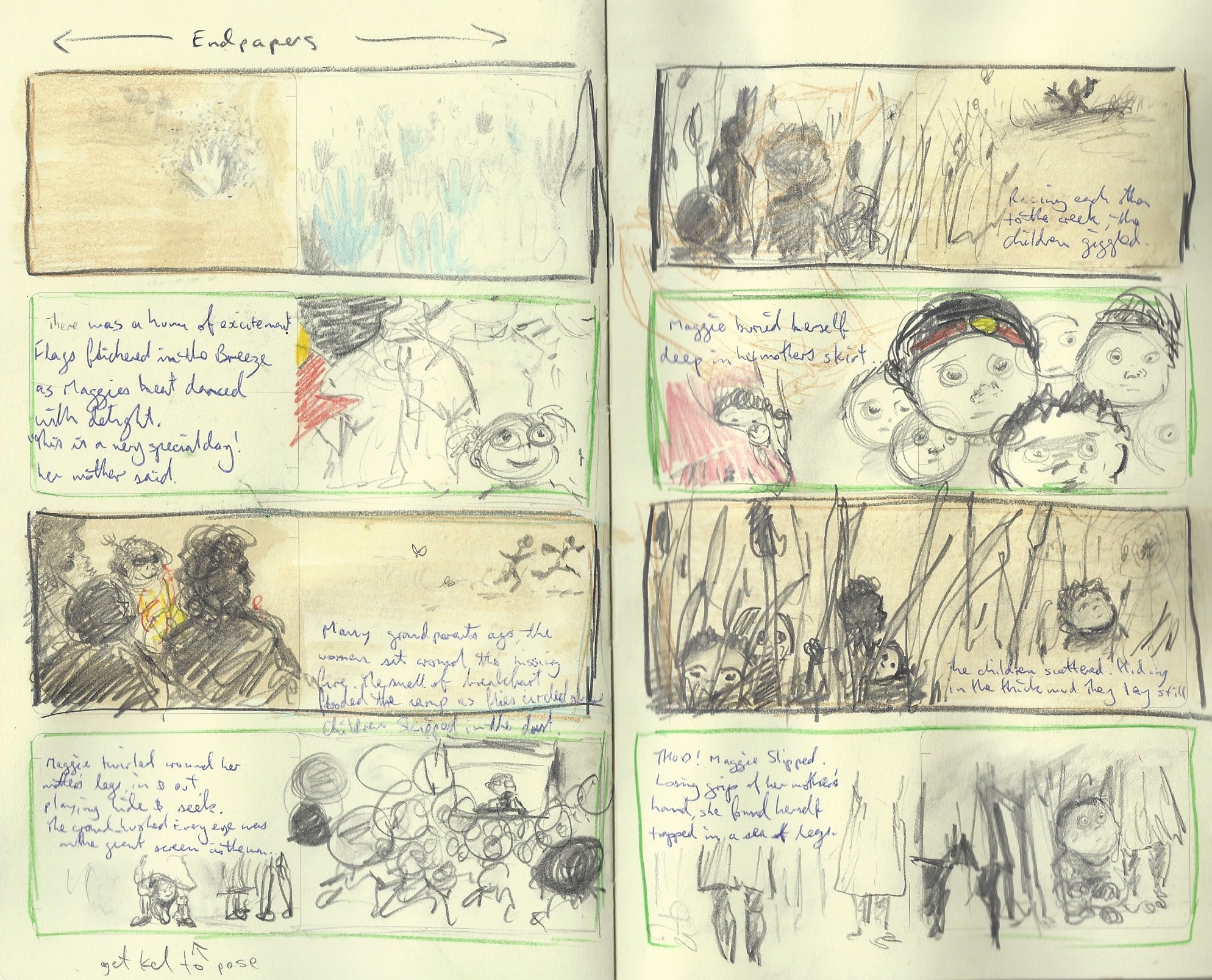
 Dub Leffler’s storyboards for Sorry Day.
IG: What led you to illustrating children’s picture books?
DL: My mother went to a psychic and the psychic told her, ‘Your son is going to write a book and he will travel overseas.’ A few months later, I moved back to Sydney and the following morning a lady came to the house I was renting to speak with my flatmate about working on children’s books. So, it literally came to my doorstep. And the rest, as they say, is history.
IG: What was the most challenging book that you’ve worked on, and why?
DL: Sorry Day was the most challenging story to illustrate due to the emotional content involved. Researching for Sorry Day was hard too—there is so much negativity out there in cyberspace in regards to Aboriginal people. I would often come across comments and replies to posts and videos filled with racism. And there was A LOT of it. This spurred me on to make Sorry Day the best book I could. It’s the most important book I have ever and, possibly, will ever illustrate.
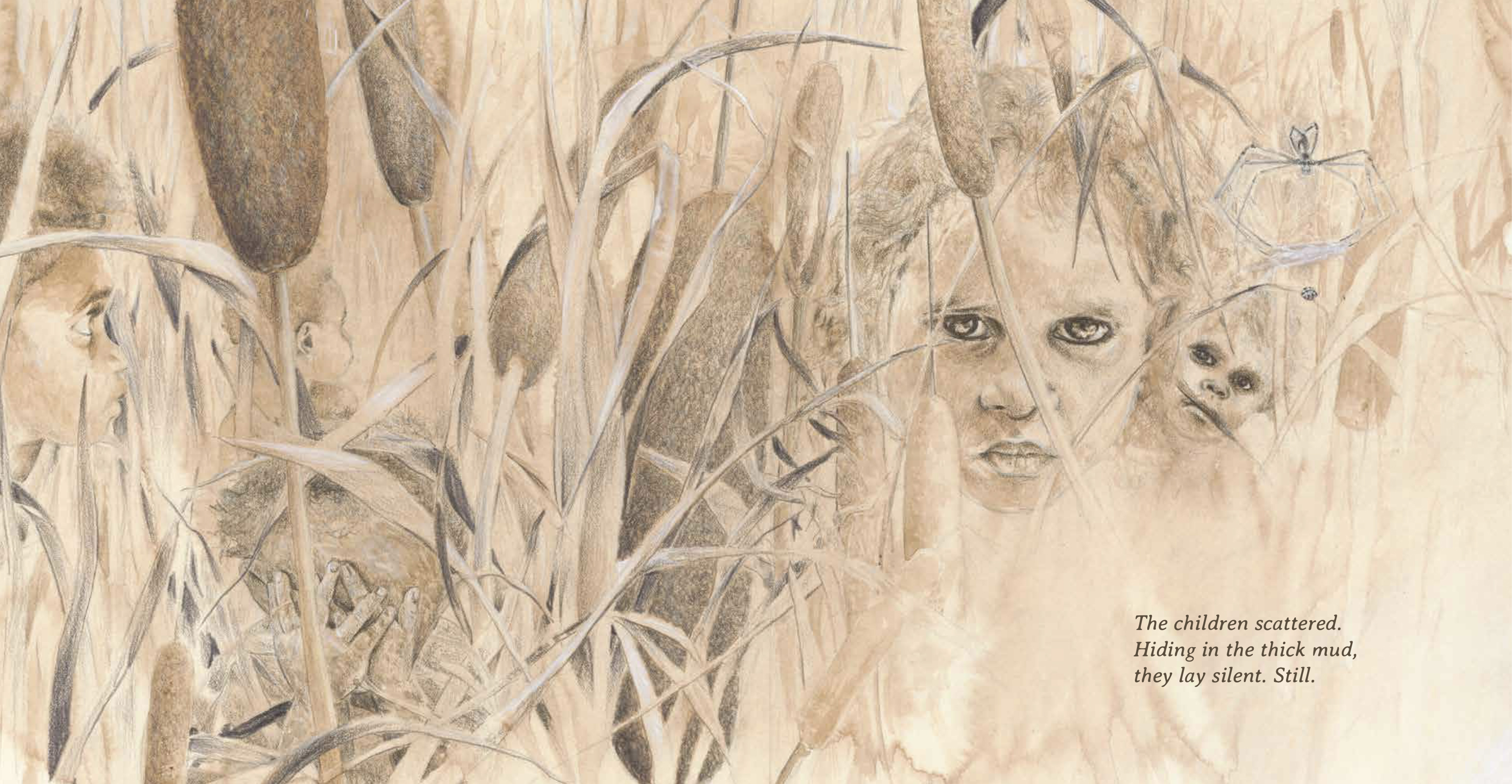
 Dub Leffler’s favourite illustration in Sorry Day.
IG: Out of all your books and illustrations, do you have a single favourite illustration?
DL: My favourite illustration would have to be in Sorry Day when the children are hiding in the creek among the bulrushes. You can hear the crinkle of the blades of grass and the children holding their breath. It has a quiet intensity.
IG: Sorry Day uses a dual narrative, with one narrative strand set in the past when the children are being stolen, and another in the present at Kevin Rudd’s apology to the Stolen Generations. The two colour schemes that you use for the two threads cleverly demarcates them. How did you come up with this?
DL: I have an old photograph of my mother. It is a faded black and white photo that has yellowed with age. I knew that this is how the ‘past’ section of Sorry Day should look. I worked closely with Amy Cullen, NLA Publishing’s graphic designer, in deciding how to use sepia tones throughout the book—at one point both full colour and sepia were proposed to be on the same page. It’s a good example of showing two different times using just illustration.
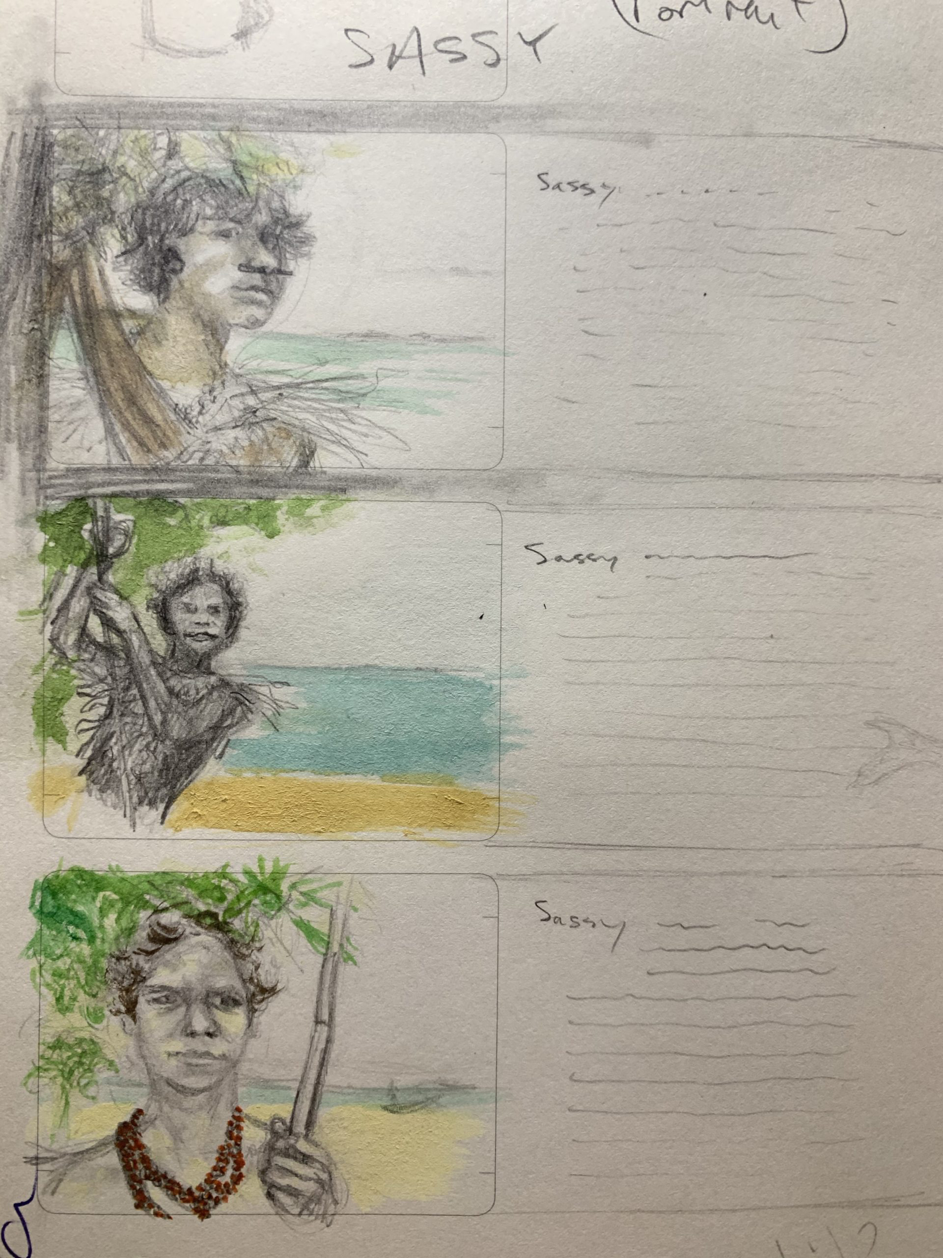
 Dub Leffler’s storyboards for Strangers on Country.
IG: Tell me about Strangers on Country by Dave Hartley and Kirsty Murray. How did you go about bringing these real people to life?
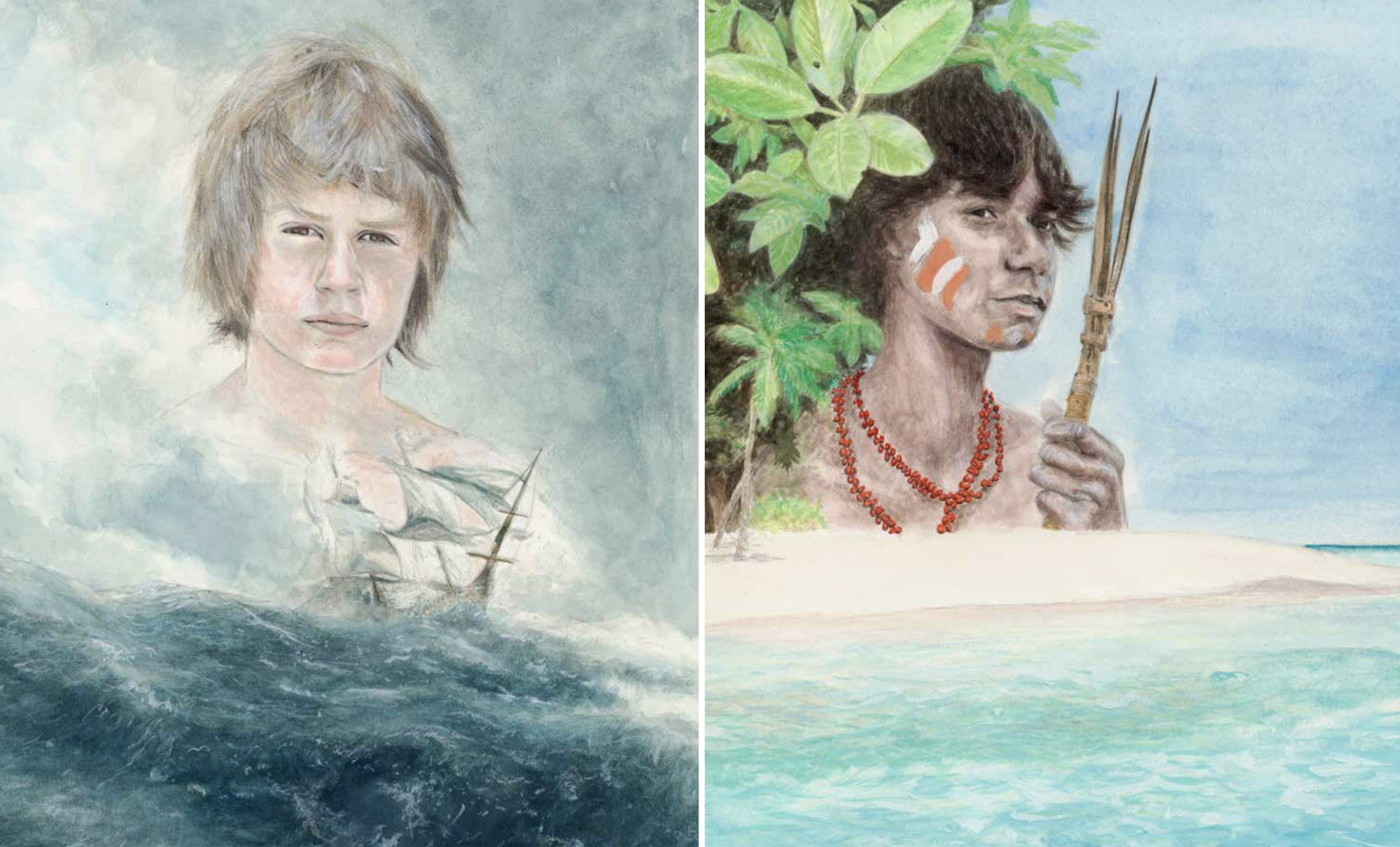
DL: The short answer is: research. The longer answer is: after I had done enough research and had collated enough reference images to form a coherent idea, I made sure to illustrate each image as if it were a still from a film—as if the people could move at any moment. I try to imbue all of my illustrations with some type of movement—even if it’s the suggestion of someone breathing, this approach can help the images come alive in the viewers’ mind.
 Narcisse (left) and Sassy from Strangers on Country.
IG: Can you take us through your illustrative process?
DL: My personal process starts with small sketches of anything that comes to mind in regards to the story. I write notes on the story and underline key words in the text that should be illustrated. I read and re-read the story many times to make sure I illustrate true to the text. From there I begin storyboards. I have a special book just for storyboards and draw many different panels exploring things like colour, technique and composition. Along the way, I may do one or two concept illustrations—they are basically finished illustrations. They give me a good idea of what the tone of the book should be and how the finished artwork will look.
Throughout this process, there is a lot of correspondence between the publisher, graphic designer and myself and once we decide on a final storyboard, I begin the final art. This usually (but not always) is something I do quite quickly—I usually finish the final art in less than a month—but it’s the preparation I undertake beforehand that takes a lot of time. The final art is basically the afterthought of all your prep.
Once I finish a piece of final art, I send photos of it to the publisher and graphic designer to make sure I haven’t missed anything, or if anything needs changing. I always draw final art to size—I mark the dimensions on the paper and am always aware of where the text will be on the page—you don’t want anything important in the illustration to be covered up with the story. It’s the illustrator’s job to support and enhance the story.
Once the final artwork is complete, a courier is organised and the artwork is picked up from my studio and six months or so later—BAM! I get a new book in the mail. And then the whole process starts again.
Irma Gold is an award-winning author and editor, and is the Ambassador for the ACT Chief Minister’s Reading Challenge. You can read her full interview with Dub on her blog.